Word Puzzle Game UX Review
Word Search (also known as Word Seek, Word Find, Word Sleuth or Mystery Word) is a word game that consists of the letters of words placed in a grid. The objective of this puzzle is to find and mark all the words hidden inside the box. The words may be placed horizontally, vertically, or diagonally.
Problem statement
Older users may be familiar with word puzzles but less familiar with mobile game conventions. The challenge was to identify usability barriers and make the experience easier to understand, navigate, and play.
-
Date
Feb 2021
-
Client Name
Genera games
-
Tools
Figma
Methodology
UCD approach
We followed a UCD approach to understand user needs and evaluate the experience against established UX principles.
Empathize
- Personas
- Empathy map
Define
- Expert review
Empathize
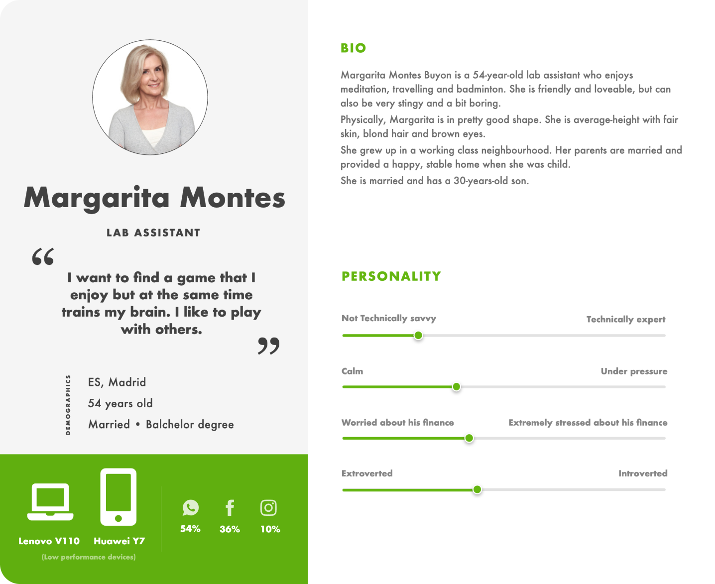
Personas
We used personas to empathize with users, align design decisions with user goals, pain points and motivations, and deliver intuitive and satisfying user experiences.
Research
Empathy map
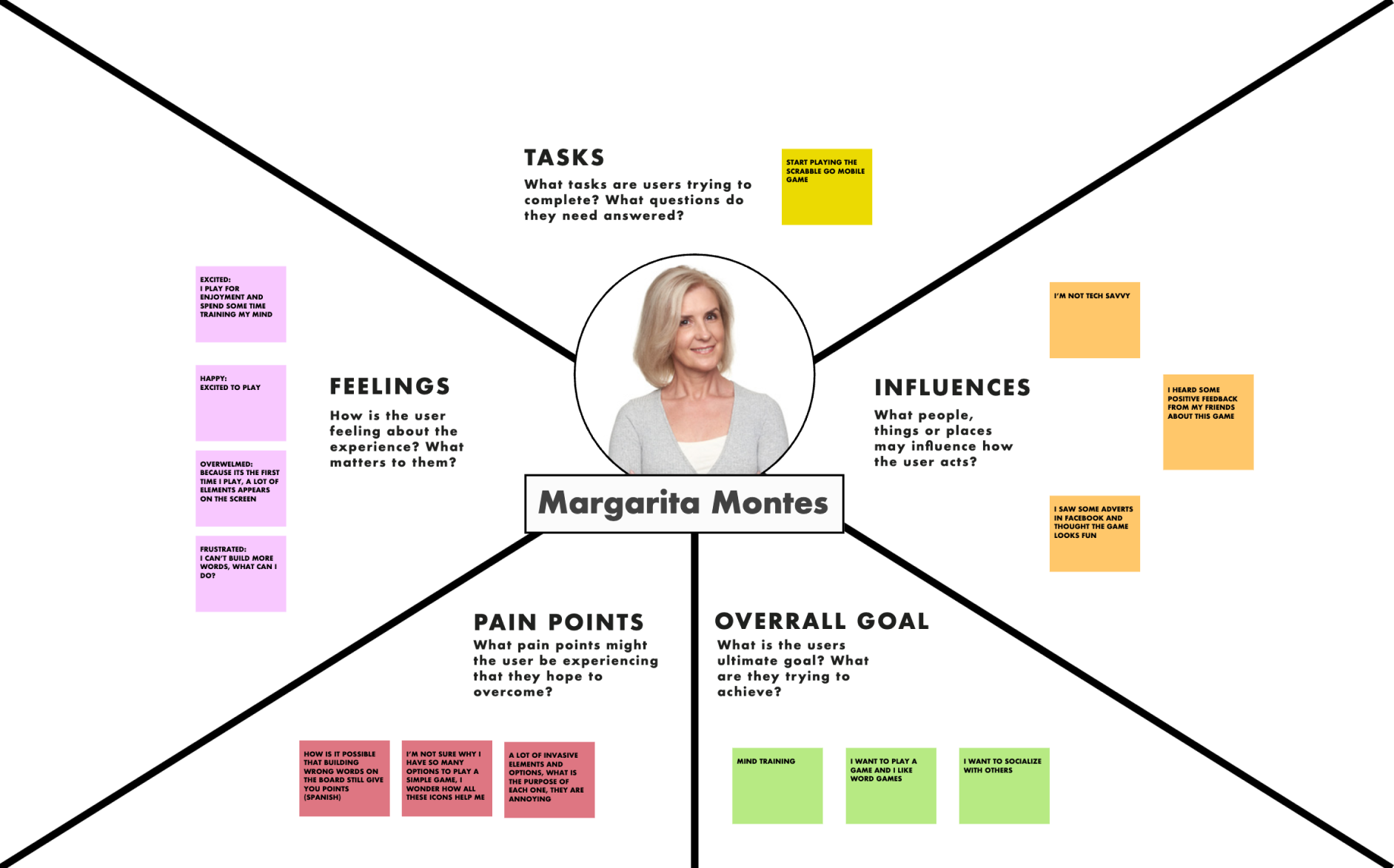
To gain a deeper understanding of a specific user persona's thoughts, feelings, behaviors, and experiences, designers and product developers use a visual tool called an empathy map.
It's a structured framework that helps capture insights about users' emotions, needs, and pain points, allowing design teams to empathize with users. The tool is widely used in user-centered design and product development, and it enables design teams to create solutions that truly resonate with users' needs.
Expert review
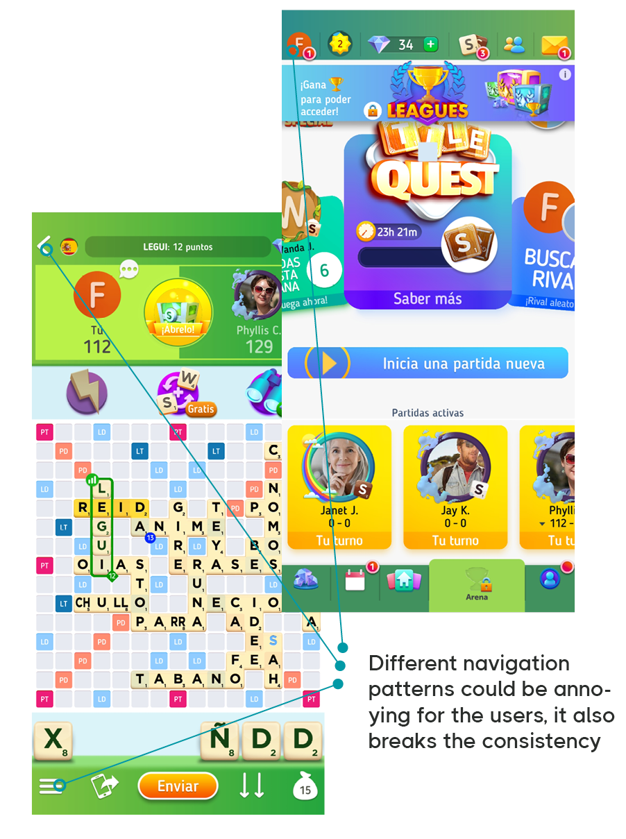
Visual hierarchy + consistency.
Visual hierarchy is one of the core techniques which are applied to the design process. It is initially based on Gestalt psychological theory.
The visual presentation of UI elements has a great influence on the user experience of a product. If content components look like a mess, people can’t navigate within a product or interact with it properly. Moreover, unstructured copy content has a low level of legibility, so users can’t scan it and they need to make a significant effort to distinguish the data they’ve been looking for.
Bad UX can lead to poor user satisfaction, which means a product would be less sought-after. It’s one of the molecules of the Design DNA. Consistent design is intuitive design. In short, usability and learnability improve when similar elements have a consistent look and function similarly. When consistency is present in your design, people can transfer knowledge to new contexts and learn new things quickly without pain.
This way they can focus on executing the task and not learning how the product UI works every time they switch contexts.
Expert review
Law of similarity
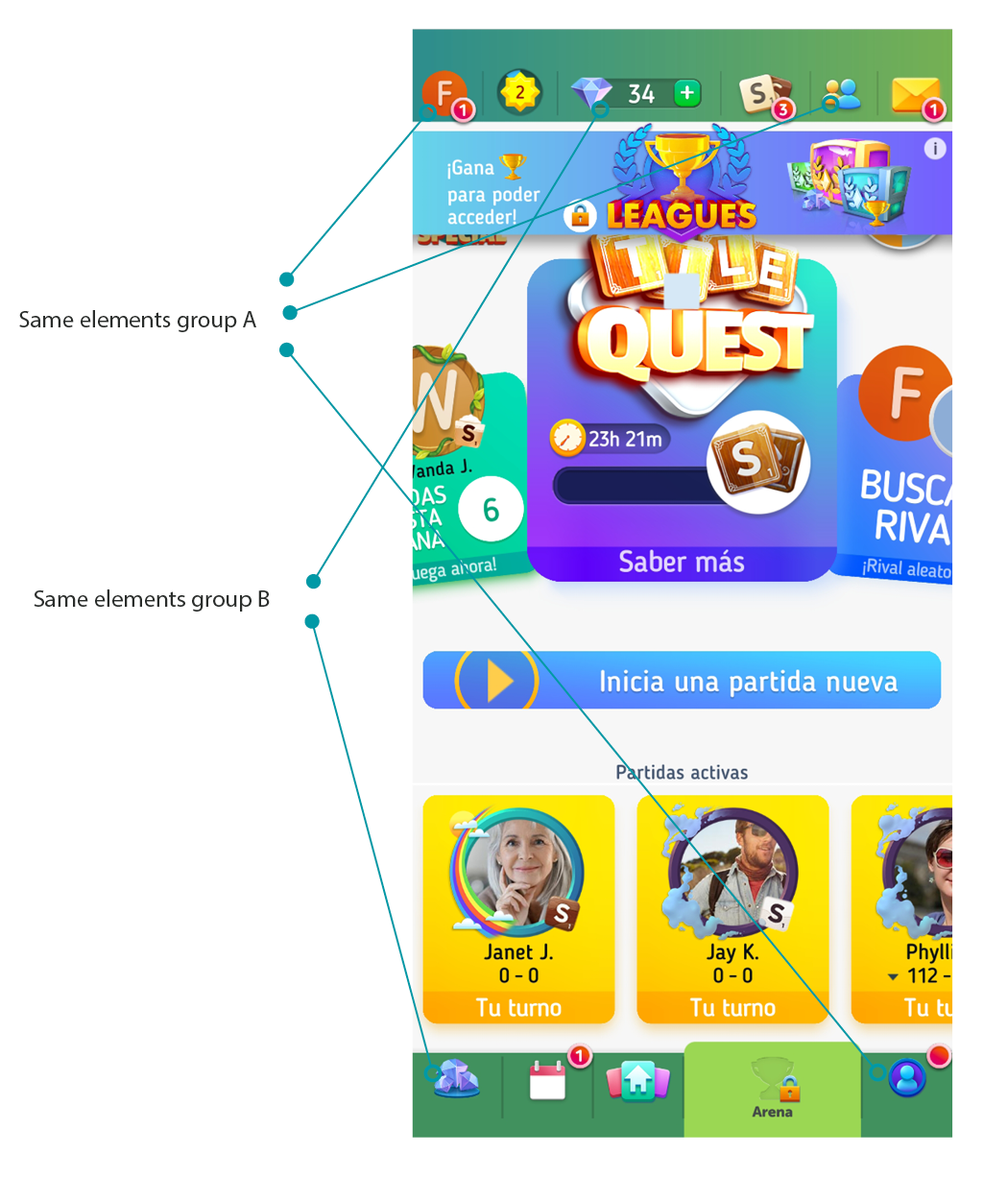
The human eye tends to perceive similar elements in a design as a complete picture, shape, or group, even if those elements are separated.
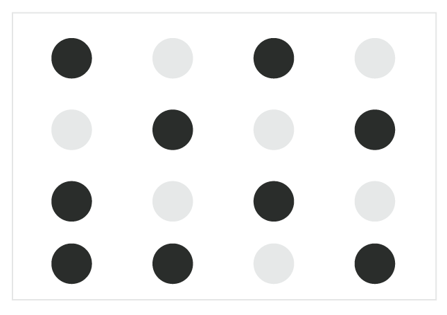
Here, similar UI elements compete for attention and can increase cognitive load. Clearer grouping and stronger differentiation would help users understand relationships between actions and content.
Expert review
Basics of Human cognitive constraints
Working memory has limited capacity and duration. For a game interface with many competing elements, reducing unnecessary cognitive load can make key actions easier to understand and remember.
Could you remember this secuence as it is?
MCDBMWFERITVRUN
or it is better like this now?
MCD BMW FER ITV RUN
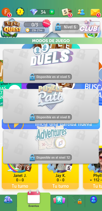
Here, the floating gray rectangles visually compete with a busy background, increasing cognitive load. Grouping related information and reducing competing visual elements can make the screen easier to scan.
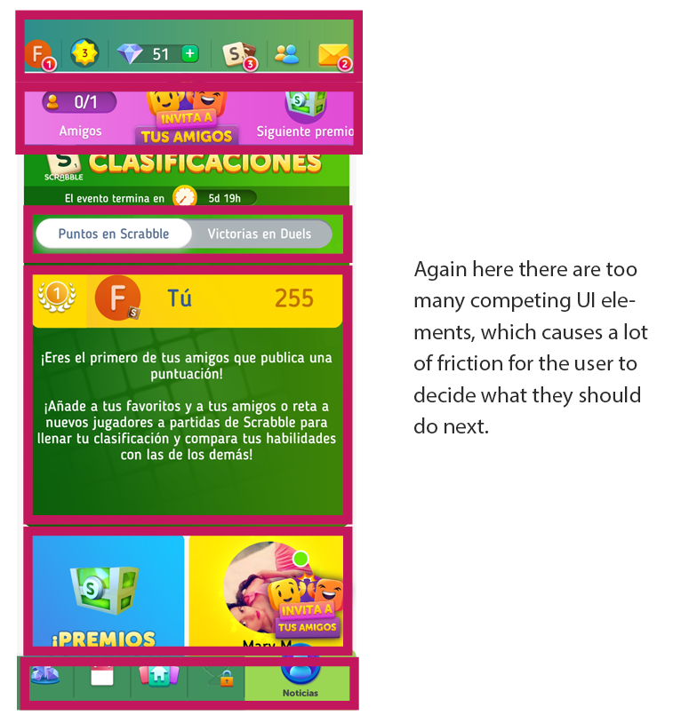
Expert review
Hick's Law
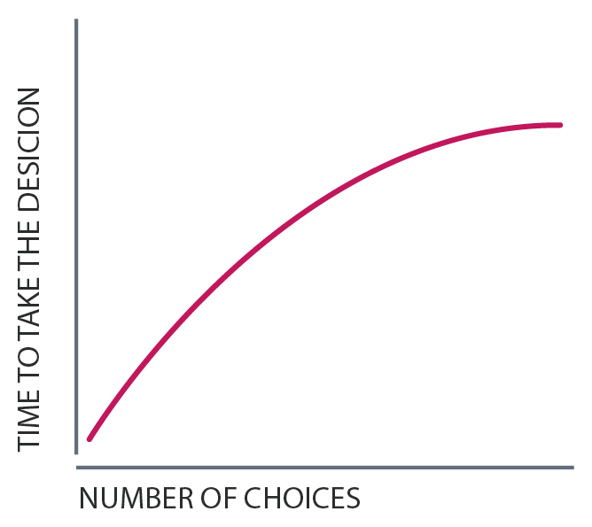
Hick’s Law (or the Hick-Hyman Law) states that the more choices a person is presented with, the longer the person will take to reach a decision. Named after psychologists William Edmund Hick and Ray Hyman, Hick’s Law finds frequent application in user experience (UX) design—namely, to avoid overwhelming users with too many choices, thereby keeping them engaged
Final Results
The review identified several opportunities to make the experience more usable, learnable, and consistent. The recommendations focused on reducing cognitive load, improving hierarchy, and making actions easier to understand:
- Hierarchy
- Have better navigation.
- Create a better consistent experience for all the users providing them better patterns to follow, so that we reduce the friction in different screens.
- Have distinct elements that each represent a unique action.
- Create a better discoverability process, a lot of elements might feel meaningless or the user doesn’t know how to use it.
- Consolidate the micro-interaction and reduce intrusive elements to a minimum.
- Replace any words that do not exist with words that do exist (words in the Spanish images).
- Create more game dynamics, like having a countdown to create a new word and providing some clues which are linked with how many points users are going to be rewarded.
- Review all user flows and user journey.