Mobile Racing Game Product Design
I worked with the team to shape a mobile racing game experience around the needs, expectations, and motivations of different generations of players. My role focused on applying UX and product design methods to turn an early game concept into a clearer product experience, connecting research and player expectations with feature definition, interaction design, and validation.
The project combined several stages of the product design process: understanding the market and target audience, benchmarking established racing games, defining personas and value propositions, mapping the main user flows, creating interactive prototypes, and validating the experience with users. This allowed design decisions to be discussed as product decisions rather than relying only on assumptions or visual preference.
Problem statement
The product challenge was to create an engaging mobile racing experience that could resonate across generations while incorporating themes around electric cars, renewable energy, and social impact. This created a balance between the expectations of racing-game players and the broader product vision: the experience needed to feel exciting and familiar enough for the target audience while giving the concept a distinctive purpose and identity.
From a UX perspective, the challenge was to understand which ideas were meaningful to players, determine which features should be prioritized, and translate those decisions into flows and interactions that could be tested before investing further in development.
-
Date
Feb, 2020
-
Client Name
Virtually life
-
Tools
Figma, Flinto, Overflow, Indesign, Principle
Research
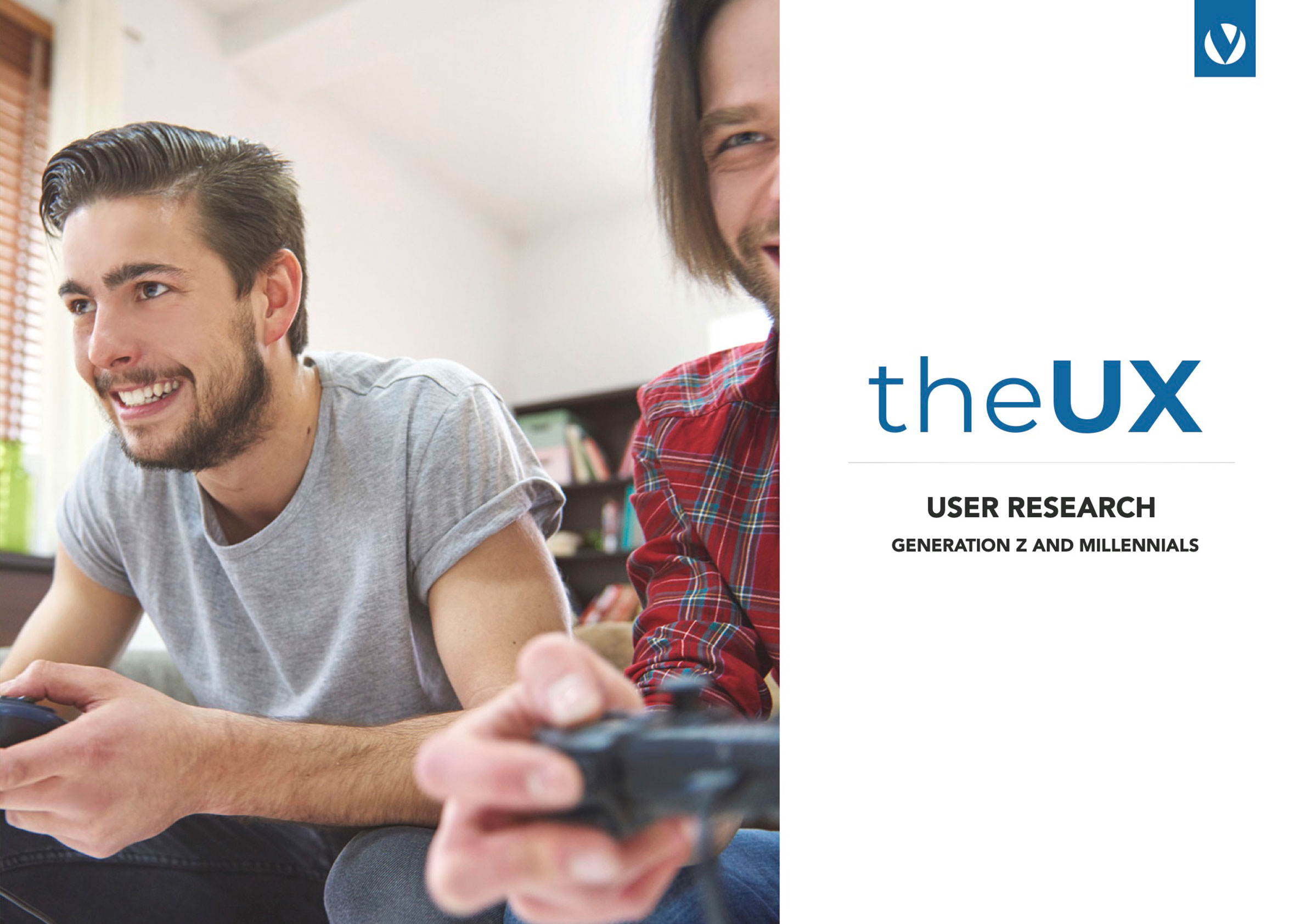
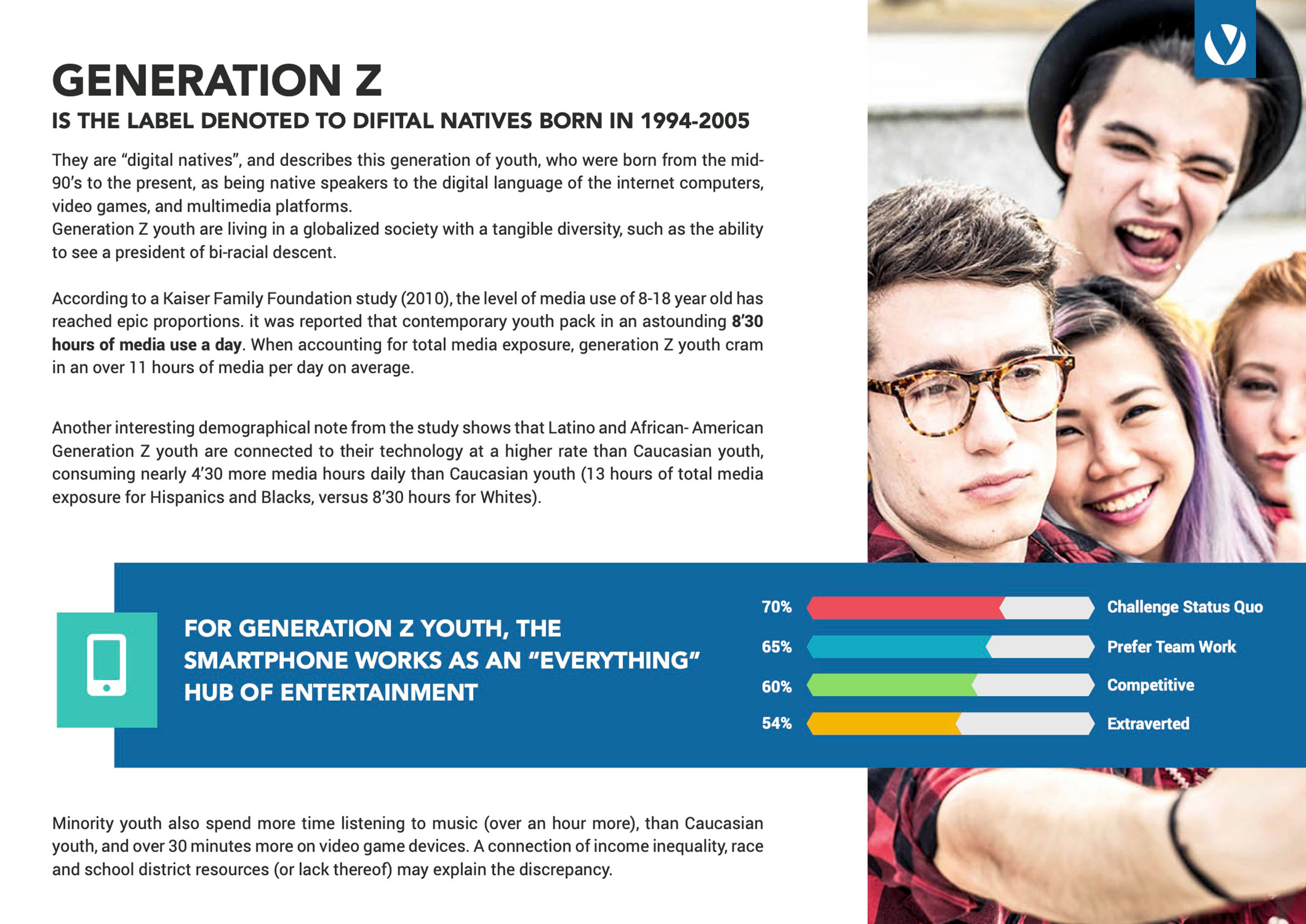
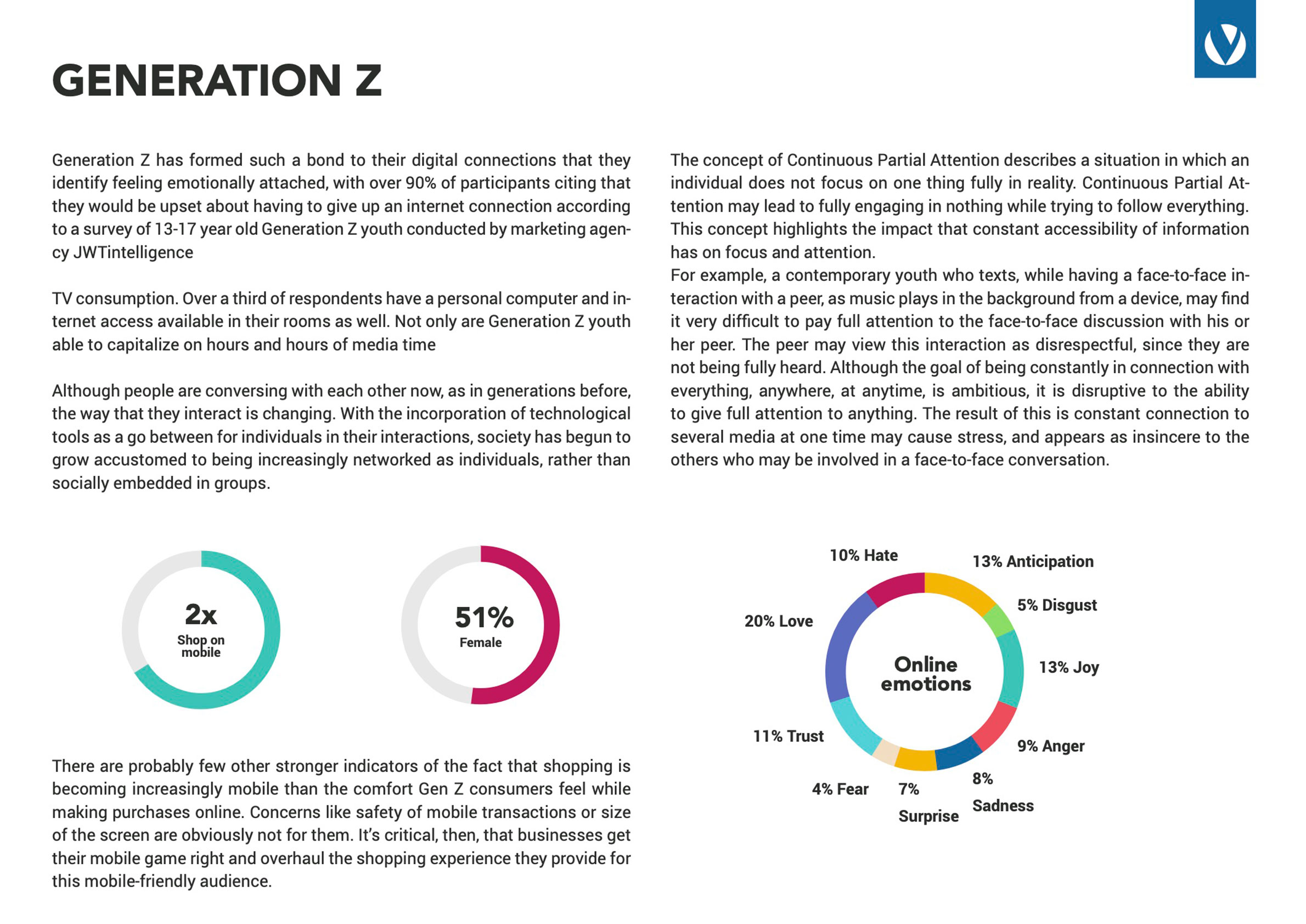
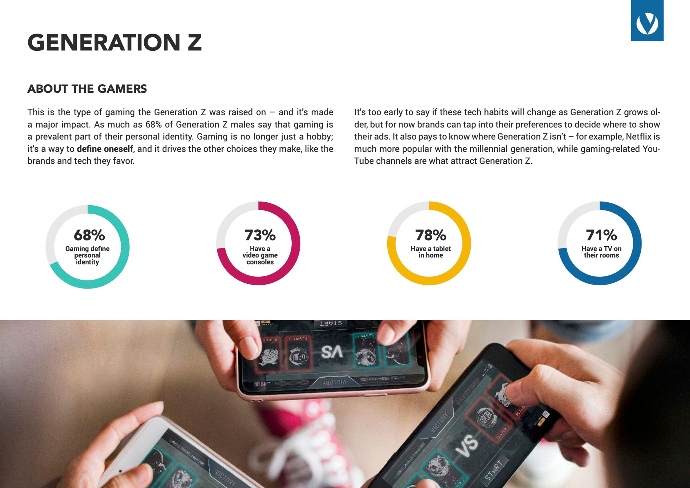
Unlocking the Potential: Millennial and Gen Z Gamers as Early Adopters
I started by looking at the audience and the characteristics that could influence adoption of a new racing game. I analyzed customer segments and benchmarked established titles such as Real Racing, CSR, Asphalt, and Need for Speed to understand the conventions players were already familiar with, as well as the opportunities for differentiation.
The benchmark was not only a visual exercise. I used it to examine how competing products structured their experiences and what expectations they could create around racing, progression, interaction, and engagement. These observations gave the team a more concrete basis for discussing which features and interaction patterns were relevant to the target audience and which ideas needed further validation.

Define
Unveiling User Personas Unlocking Insights for Enhanced User Experiences
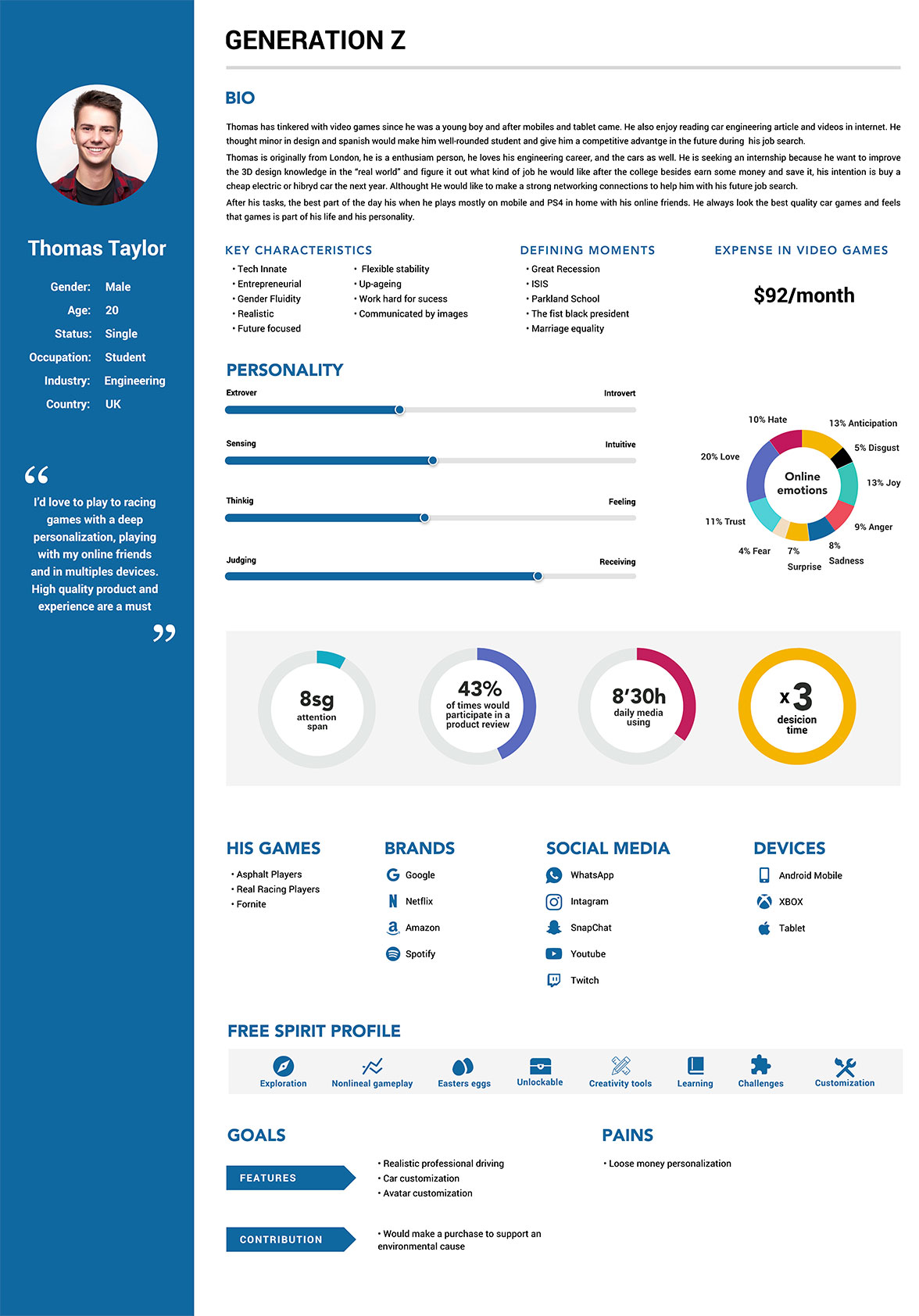
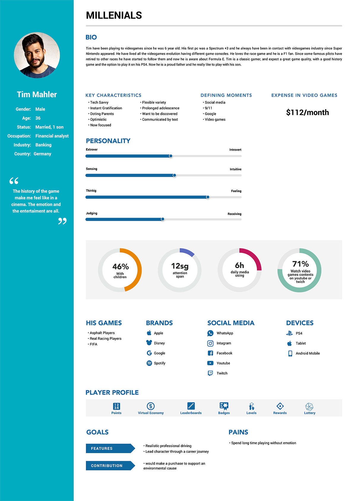
I translated the research and existing knowledge of the audience into personas that captured relevant needs, behaviors, motivations, and pain points. The objective was to move the conversation away from a generic idea of “the player” and make the differences between audience needs more explicit.
The personas gave the team a practical reference when discussing features and experience decisions. They helped us consider whether a proposed interaction solved a meaningful user need and whether the experience was aligned with the expectations of the audiences we were trying to reach.
I also used the personas to consolidate research findings into a format that stakeholders could use during product discussions. This made user needs easier to communicate across UX, game design, development, and product stakeholders, and created a shared language for evaluating ideas before moving into detailed design.
Define
Crafting Value Propositions: Driving Customer-Centric Product Development
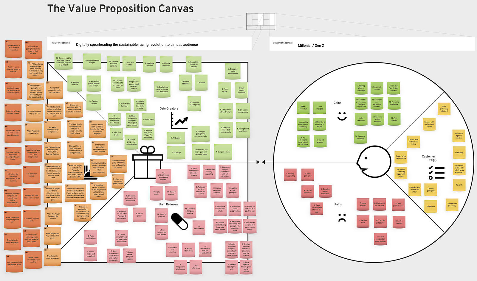
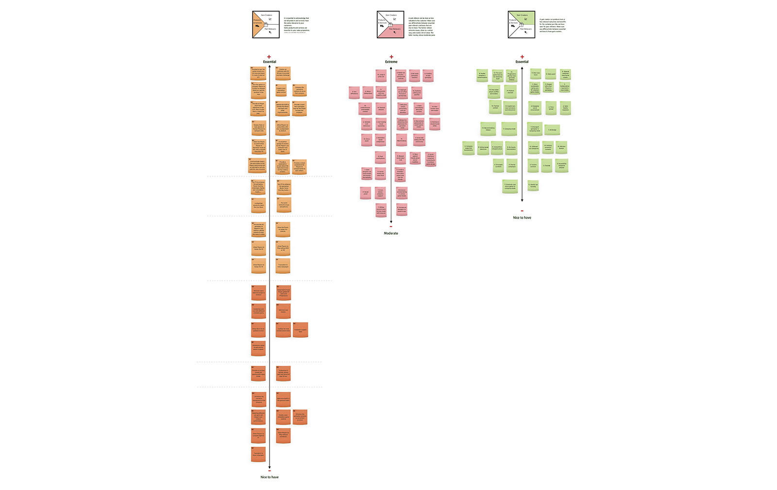
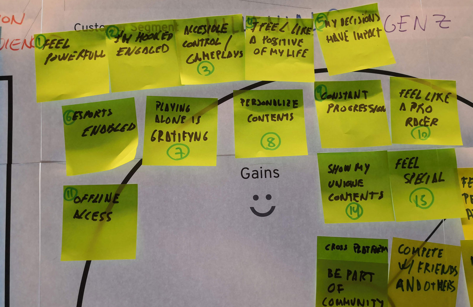
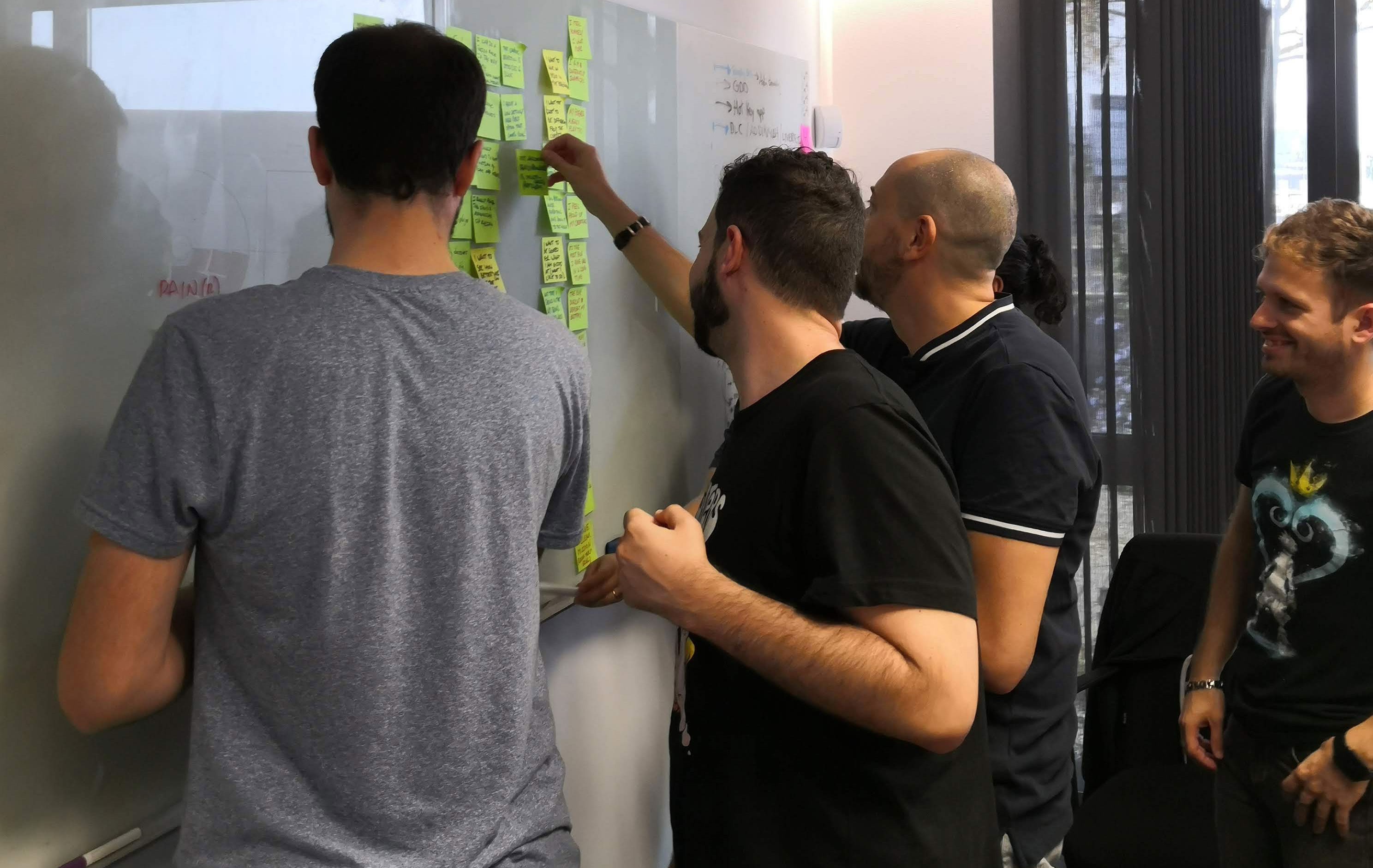
I then used the Value Proposition Canvas as a collaborative bridge between research and feature definition. Working with UX, game design, developers, and Product Owners, I mapped user needs, pain points, desired gains, and the product or service ideas that could respond to them.
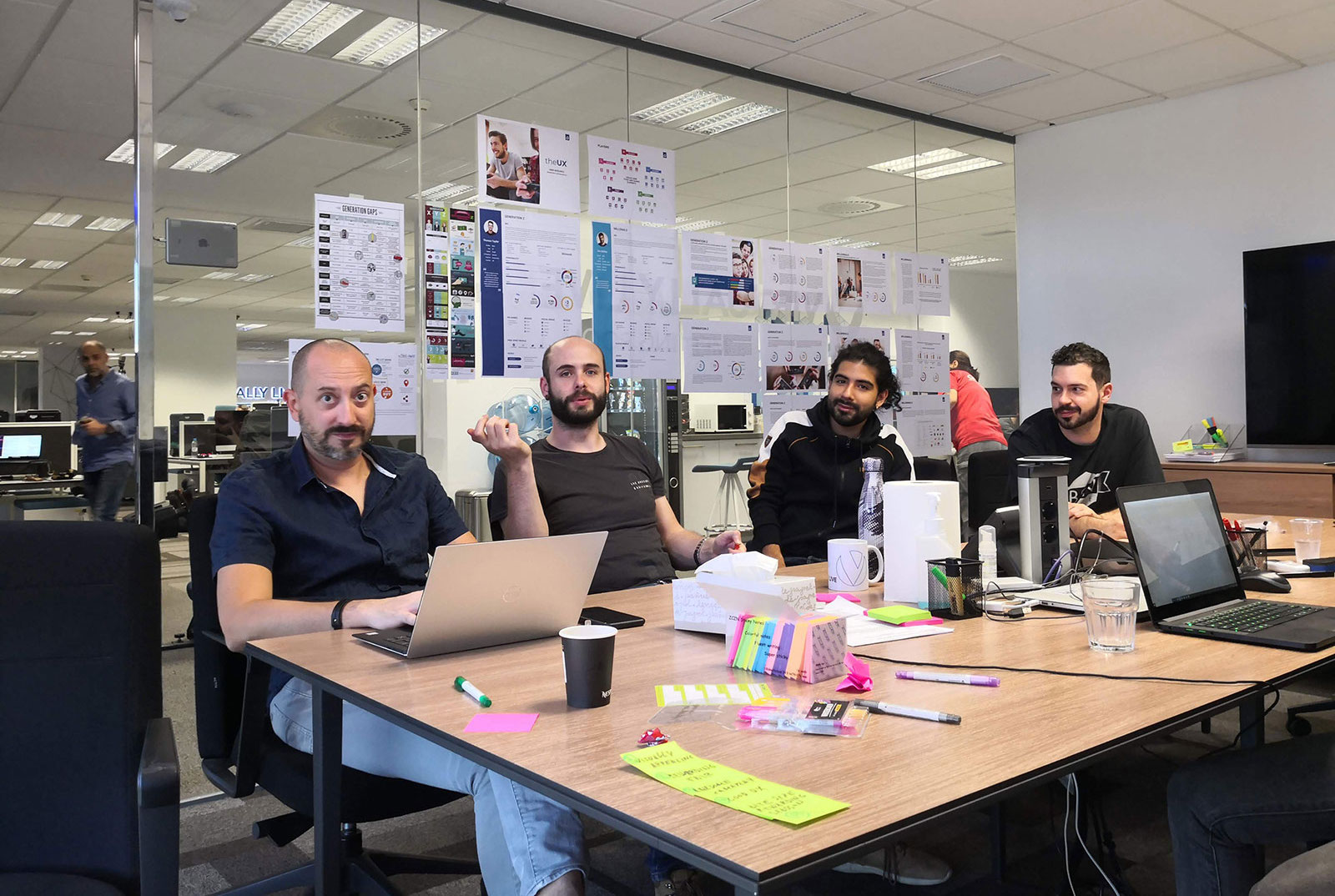
This exercise was particularly useful because the team was not evaluating features from a single perspective. UX could bring the user perspective, game design could consider the experience and gameplay vision, developers could identify feasibility constraints, and Product Owners could connect the discussion to priorities and delivery.
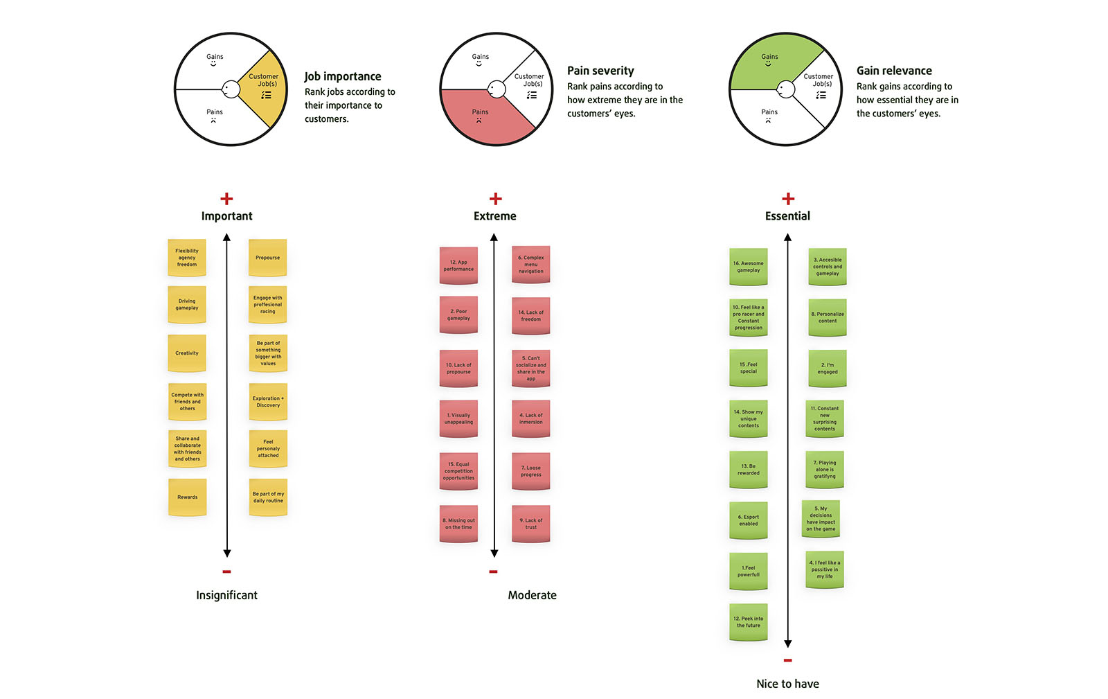
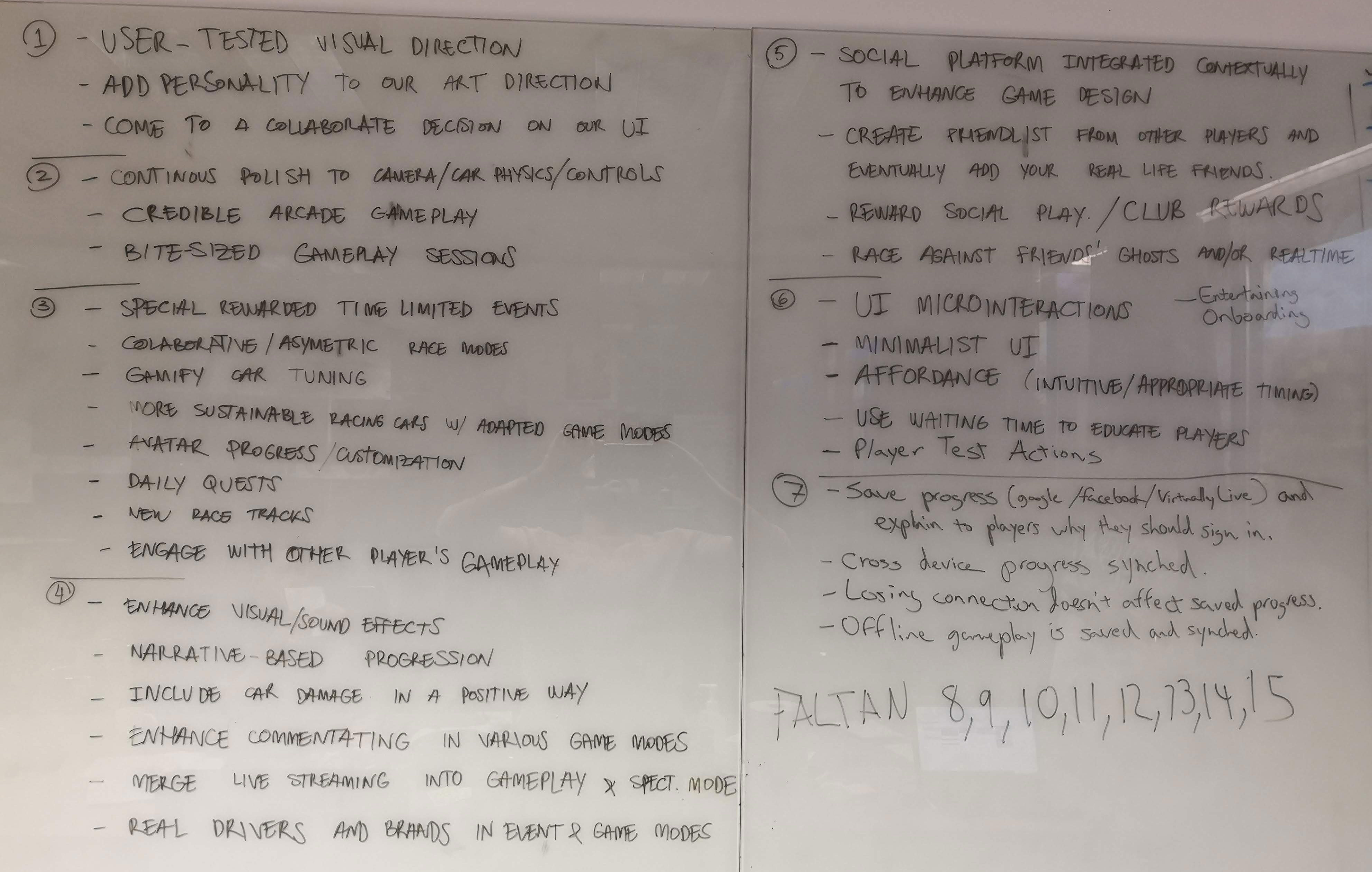
During the workshop, we evaluated features against user needs and project constraints. The purpose was to distinguish between ideas that sounded attractive and ideas that had a clear relationship with a user need or product objective. This helped the team prioritize concepts that were both valuable to users and realistic within the delivery timeline.
By connecting the customer profile with the value map, I could make the rationale behind each feature more explicit. The milestone tags M1, M2, and M3 were then used to connect the identified product and service opportunities with the intended delivery sequence.
The Value Proposition Canvas therefore became a practical decision-making framework rather than a documentation exercise. It helped us keep the relationship between user needs, proposed features, and project milestones visible while moving from discovery and definition into the design phase.
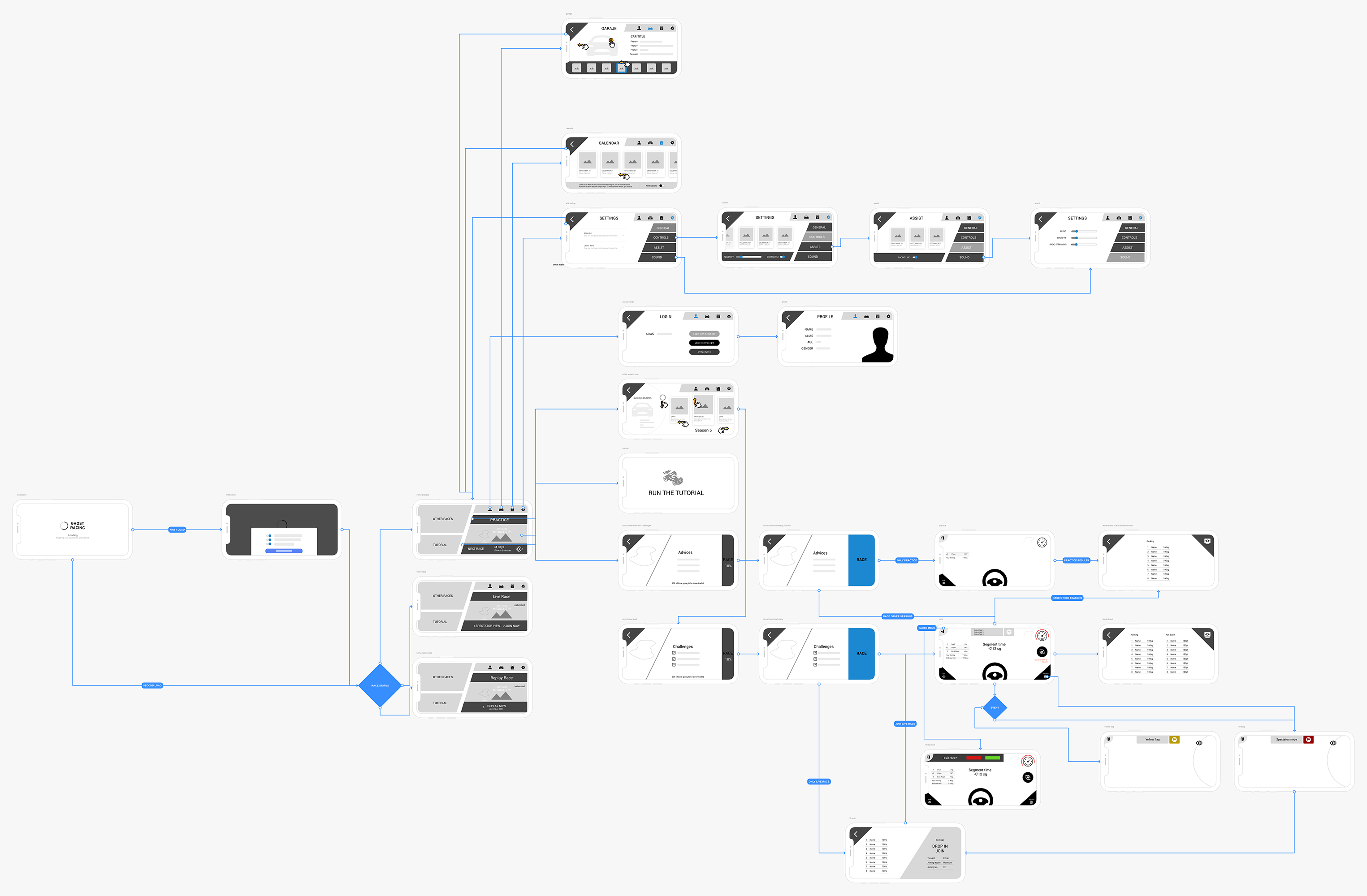
User flow
Following the workshops, I translated the agreed feature priorities into user flows for the main functionality. The objective was to turn the high-level feature definitions into concrete sequences of actions, showing how a player would move through the experience and where decisions or interactions would occur.
Creating the flows before moving into detailed UI allowed the team to review the logic of the experience at a lower level of fidelity. It also created a clearer foundation for the alpha and beta wireframes, making it easier to iterate on structure and interaction before focusing on the final visual layer.

Prototypes
Iteration one and two.
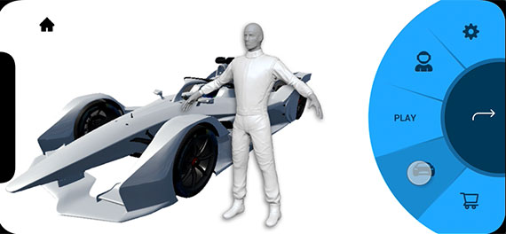
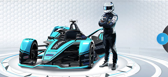
I developed two prototype iterations to progressively explore and refine the experience. The first iteration was used to make the proposed interactions tangible and expose areas that needed clarification. The second iteration incorporated the learning from the previous version and refined the interaction patterns while keeping the product goals and target audience in view.
Working at prototype level allowed us to test the experience before treating the interface as final. It also made it easier to communicate the intended behavior to the wider team and discuss specific interactions rather than abstract concepts.
Prototype
Prototypes through structured user interviews
Using an interview script, we gathered both qualitative and quantitative feedback while users interacted with the prototypes. The sessions allowed us to observe reactions to the experience, identify points of friction, and challenge assumptions that had been made during the design process.
The purpose was not simply to ask whether users liked the design. I used the sessions to understand whether the proposed flows were clear, whether the interactions matched users' expectations, and which elements deserved further iteration before moving closer to the final interface.


Final Results
The project gave the team a structured way to move from an ambitious game concept to a more evidence-based product experience. Research and competitive analysis helped establish a clearer understanding of the audience and the existing racing-game landscape, while personas and the Value Proposition Canvas helped connect those findings with feature decisions and product priorities.
User flows and prototypes then made the proposed experience tangible enough to review and test. User testing provided direct evidence about how people interpreted the interactions, allowing us to challenge assumptions and identify areas where the experience needed refinement rather than relying only on internal opinions.
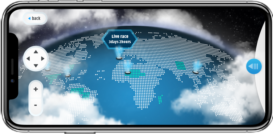
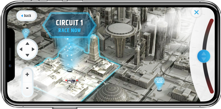
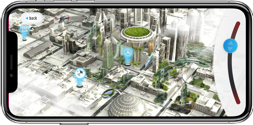
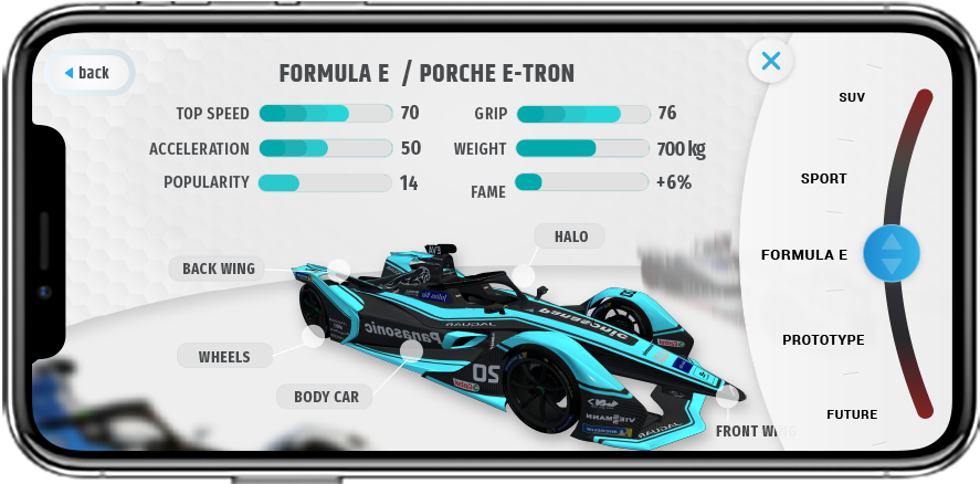
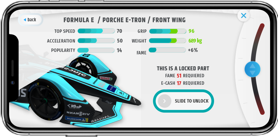
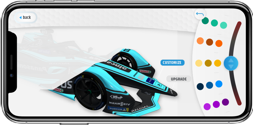
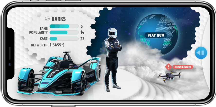
The final UI work brought those decisions into a cohesive mobile experience. By combining user evidence with the game designer’s vision, I helped create a clearer relationship between product goals, player expectations, and interface decisions, while using iteration to reduce friction in key interactions and establish a stronger foundation for further product development.